

Are you sick of your type looking plain and boring? Many OpenType fonts have alternate characters built into them that can transform your type into a beautiful piece of art. By using these alternate characters you can add things like flourishes and flair to your type with ease. Some type faces have alternate characters that can help out with legibility at smaller sizes. Even some handwritten fonts have alternate characters to change the style of a characters to make it seem more handwritten. In this article we will take a deep dive into using alternate characters.
How do you tell what fonts have alternates? Well most likely the fonts you are downloading from free font sites like DAFont.com will not have alternates. You have to pay money for a good font, where the designer of the font put in extra characters into the font family. At the end of this article, I have listed some of the most amazing fonts that have alternates.
Types of Alternates
Ligatures – This is where two or more characters are linked together. If you look at the example below the T and H characters are linked together. The font used in this example is Aphrodite Slim Pro.

Logotypes – This is where a word is stylized as a logo to be included in your type. You will usually find these in the Show Entire Glyphs and not as an alternate.
![]()
Biform characters – These alternate characters can make capital letters have a lowercase look or lowercase letters with capital letter look while keeping the same size and weight. The font used in this example is Press Gothic Pro.

Swash characters – This is where a certain letter can have a fancy look to them. You will see swash characters in lot’s of calligraphic fonts. They are very useful at the beggining and end of a word. The font used in this example is Burgues Script.

How To Access Alternates
To gain a better understanding of how you can benefit from using alternate characters, we should first look at how you can access them. Both Adobe Illustrator and InDesign have a great way to access these alternate characters. Unfortunately, Adobe Photoshop does not have a way to access them via a Glyphs panel. In this tutorial we are going to use Illustrator.
Step 1
The font I am going to be using is Aphrodite Slim Pro. It is an amazing handmade font full of alternate and ligature forms designed by Sabrina Lopez and Maximiliano Sproviero. You have to purchase it, but it is well worth your money. You can buy it from myfonts.com here. Make sure you buy the Pro version as it includes all the different alternate characters.
Step 2
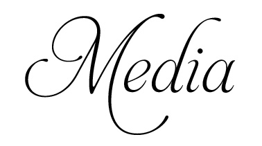
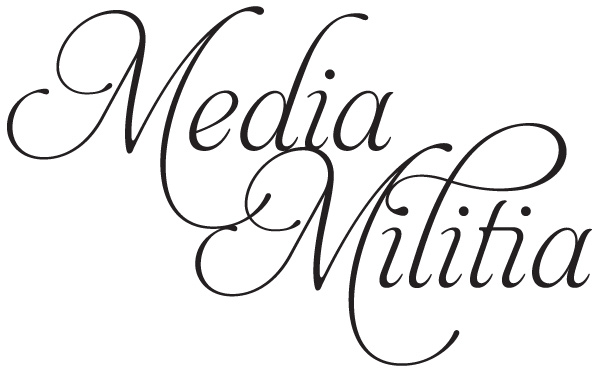
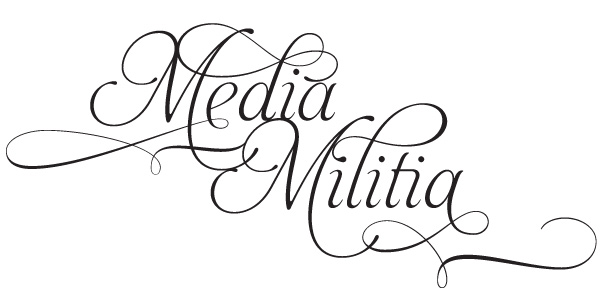
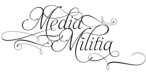
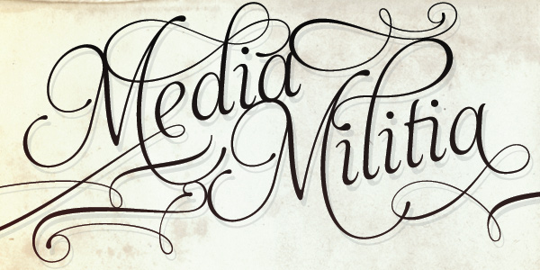
Using the Type Tool, type out Media on one layer and change the font to Aphrodite Slim Pro. I set the font size to 72 pt.
Step 3
Using the Type Tool create another type layer and type in Militia. Place it where you feel fit.
Step 4
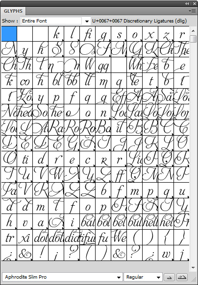
Open up the Glyphs panel by going to Window > Type > Glyphs
This Glyphs panel gives you the ability to see all of the characters as well as the alternate characters for any given font. This panel is the heart to this tutorial. It opens by default showing all the characters available for the font.
Step 5
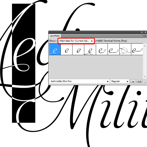
It is great to see all the different characters available to us, but the real power of the Glyphs panel is being able to show the Alternates for a selected character.
With the Type Tool, select the first "e" in Media. In the drop down box for Show change it to Alternates for Current Selection. This will show all the alternates for the letter e. Find one you like by clicking on each of the different thumbnails.
Step 6
Continue going through and selecting different characters and seeing which ones look the best. Don’t over do it though!
Step 7
You may have noticed while selecting some of the characters that there are ornaments included with the type. I created two new type layers and found two ornaments that fit in perfectly with the type. The letters I used were X and Y. Using the selection tool I put them up against the other letters.
Tip:
While Photoshop does not have a Glyphs panel, you can create your typography inside of Illustrator and copy and paste it into Photoshop to manipulate.
Great Fonts With Alternates
Aphrodite Slim Pro
This font as seen in the tutorial above has more than 1000 glyphs. It a beautiful calligraphy based font.
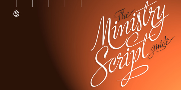
Ministry Script
Ministry Script was designed to be “A time capsule that marks both the American ad art of the 1920s, and the current new-millennium acrobatics of digital type.
Over 1000 characters
Affair
Affair is an extraordinary new calligraphic typeface by Alejandro Paul with a party full of swash characters, ligatures, and ornaments.
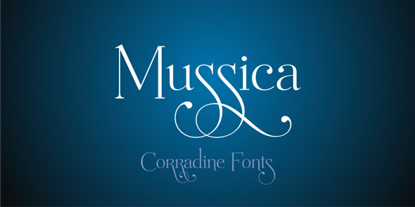
Mussica
Mussica is a crisp font created by Corradine Fonts. It feature a few extra glyphs for your characters that add a wow effect.
Blanchard
Blanchard is a revival and elaborate extension of Muriel, a 1950 metal face made by Blanchard Trochut for the Fonderie Typographique Française, that was published simultaneously by the Spanish Gans foundry under the name Juventud. Blanchard is a script that embodies the post-war narrow decorative aesthetic that would become the instantly recognizable feature of that era’s design.
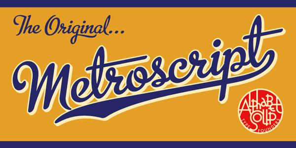
Metroscript
Metroscript is a handwritten script with styles from the 1920s and the 1950s. With a huge vintage sports theme, it has many ligatures, swashes, alternates, foreign accented characters and tails—all of which connect seamlessly.
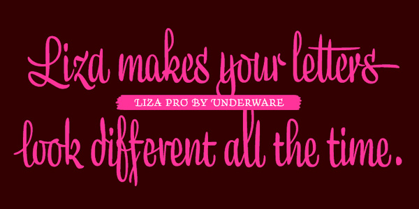
Liza
Liza Pro, Underware’s latest creation, is a live-script typeface. Thanks to its extremely intelligent OpenType architecture, she approaches human hand lettering as close as technically possible. Liza Pro deeply analyzes the text. Out of a stock of 4000 hand crafted characters, Liza creates the most optimal combination. All of this works automatically. All you need to do is typing your lettres d’amour, and Liza makes the text always look different.
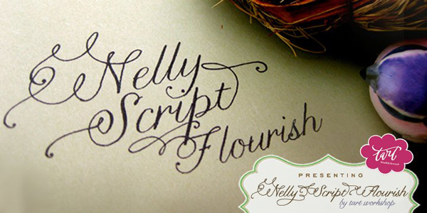
Nelly Script Flourish
Nelly Script Flourish is the jewelry to a beautifully appointed lady, the icing to the wedding cake, the VaVoom! Nelly Script Flourish comes complete with a large variety of alternate upper and lowercase forms in OpenType format.
Mon Amour Script Pro
Mainly for invitations; Mon Amour Script Pro, is an Open-Type font, which will delight you. It has the alternate, swash and ligature functions.
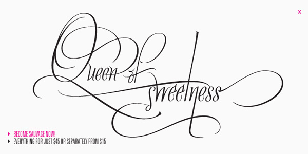
Quijote Sauvage Pro
Quijote Sauvage Pro is a very expressive calligraphic font. It includes all the ligatures, alternates and swashes..
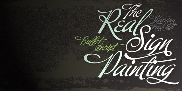
Buffet Script
Buffet Script is based on fantastic calligraphy by Alf Becker, arguably the greatest American sign lettering artist of all time
Paradise Script
Paradise is a script font thought to be used in a wide range of pieces of design. From packaging to invitations, Paradise really looks elegant and sometimes playful at the same time. The possibilities of alternates, ligatures and combinations of them are huge. Calligraphy lovers know that words sometimes start or end with extra flourishes: This is the reason of Paradise Starters and Paradise Finishers, which will always give a sensual touch to the written word.

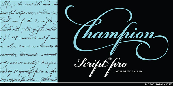
PF Champion Script Pro
PF Champion Script Pro is the most advanced and powerful script ever made. Four sets of alternate swashed capitals as well as a plethora of ornaments and frames (117) was included.

This is an excellent article on Alternate Typography. I haven’t seen anything like this before, very deeply researched and uniquely presented.
Are there any FREE alternate fonts?
The tutorial was really good. Thanks Jeya
Thank you Richie! I have been playing with glyphs for a while now and everyone I show them to is amazed that they never knew they could do that. I would think more designers would know about using them if some of the free fonts had these OpenType features built into them. Unfortunately, I went looking for about 30 minutes looking for some good free OT fonts and found nothing.
If you find any good free fonts, please leave a comment. Thanks!
I’ve been using alternate caps and swashes for years, but not with Opentype fonts. With each font, I received a chart that showed the alternates and the keys that produced them. I just purchased Burgues only to find out that I can’t use the alternates. I use an old version of Quark. Is there an alternative to using the palette to get these “extras:?
Great tutorial… Your site is starting to become my no.1 daily site that I go to in the morning at work.
Keep up.
That’s awesome to hear! Thanks! Right now we try to release 3 times a week. Monday – Wednesday – Friday. Hopefully we will be able to release daily within the next few months.
Great explanation here! thanks for the Font suggestions; I really like Mussica!
Thanks Josh! I am glad you liked it. Yeah, Mussica is such a cool font. For $34.95, it’s not that bad.
Fort just $3 more, you get Mussica and Mussica Swash – I think I’m gonna buy the Family today… Great, simple clean font!
Lisa takes the cake. Studio Lettering by House deserves a solid bump here, too. Affair is nice but can get kinda crazy looking (glyphs not mixing well) if you go overboard with it.
Studio Lettering by House is amazing! Tons of neat features. This is a must have font. Here is the link if anyone wants to check it out: http://www.houseind.com/fonts/studiolettering
Great article, I must admit I had no idea about how the alternate typography is done… simply awesome results.
Wow jeya – thanks for this great post. It has opened my eyes to something completely new! Thanks again 🙂
Guess what? You just stirred the pot right here my friend :), I didn’t know about this. Probably because I haven’t been that into type as much as I should have been.
Awesome article. You just taught me something new.
Peace Homie.
J
Nice one. Never knew this before. Something new for me.
Very good article on alt. typography.
Just wanted to point out that you can take this even a step further. After choosing the font and alternates you like, you can create outlines of the text and make adjustments to each separate letter to get a unique look (for your logo)
ps. I just love the Mussica font.
Very good point. Thank you for the tip. You can really make it look a lot more customized and unique.
I never knew this before!
Opening my Glyphs panel right now 🙂
Jeya Great article and tutorial. So many people don’t know about alternate characters or how to access them. Though it still kills me that you can’t access them in photoshop, sometimes it is such a pain to open up Illustrator just to get some alternates so I can import them into photoshop.
BTW thanks again for the email conversation last week….I am actually writing an article for Friday that will be about some of what we talked about in regards to creativity in design.
Keep up the good work!
Your very welcome! It really is amazing that these features have been around for over 10 years and Photoshop still doesn’t have a Glyphs panel. On top of that, Adobe is the one of the companies that developed OpenType. Go figure…
Loong forward to your article. Take care…
I had heard of alternate glyphs, but never knew how to use them. Thanks very much!
I believe the Vancouver 2010 logo uses biform alternates. True or false?
I think you are right. What font is that? Myfonts.com says it is FF Quadraat Sans. Looks a little different though.
absolutely amazing thank you so much for sharing this information, i as well haven’t learned this yet, definitely something to impress the teachers with!
and on another note, thank you as well for taking time from your daily life to launch a website like MM, 2 thumbs up!
excellent article
Thanks Jeya,
Great post Jeya.
I want to share with you this link with a calligraphic fonts for free: http://webtoolkit4.me/2010/01/11/5-excellent-calligraphic-fonts/
I hope be useful for all.
Awesome! Thanks for the link. That Scriptina font looks pretty cool. No alternative characters but looks fresh by itself.
Wow, great article! With SO MANY design blogs
out there, I’m sure it’s tough to come up with
original content. This, my friend, is great stuff!
@Anthony: Wow…Thanks! It really is hard to find new and original content. That is out goal to come up with new articles that are unique. The design blogosphere is oversaturated with roundups of crap…
Thanks, Jeya. Very cool. I’d seen these text effects but didn’t know how they were done or even what they were called.
You learn something new everyday and this was it. Thanks for sharing. I had no idea about this technique. You’ve definitely inspired me to check out your other posts.
Great work!
Lovely, just like the rest of your site
Great tutorial as well as great resources. Will be sure to have my staff check out this one so they can learn more from what you have shared.
A great way to create a truly unique set of fonts for branding and customization with logos and other graphic design.
Thanks again!
Great article with some very useful information.
I didn’t know about these alternate characters, but I’ll definitely use them when I have the change to.
I’m just curious if there are any alternatives to Illustrator or InDesign that don’t cost bags of money and can also “see” the alternative letters. Or is there any way to use for this purpose any font-viewers or fontforge? I guess it would be nice to know about an affordable / free alternative.
Its extremely encouraging to see someone do so well..!
wow… its very good…. this is very useful tutor… i liked it.. thanks
Great explanation!!! I’m usually very lasy with the fonts… I gonna try it! Thanks
Hey man really cool tutorial… keep the good stuff coming…
vinnie
http://www.graphitivity.com
I’ve been using alternate characters for years. You have a few lovely scripts here that I haven’t looked in to yet!
To most of you out there, if you really want to get in to alternate characters you’ll want to drop some coin as in the end it’ll be worth it. On the other hand, just so you can get started and learn to play with a few glyphs, here is a free script that’s constantly changing and under construction.
http://www.impallari.com/lobster/
If at all possible, I’d make a small donation for the hard work put in to this font however!
yay! You really know how to use our creation!
Thank you for showing Aphrodite Slim in the way you do.
I am glad you like our font, it’s been a difficult task, long hours of drawing and drawing, so it is wonderful and encouraging to know that there are people like you that appreciate our work.
We are working on many new projects that are going to amaze you. 😉
Best,
Lian and Sav.
TypeSenses + Lian Types
just bought the Aphrodite Slim Pro package and I must say that it is refreshing to work with…the tremendous amount of work put into it is clear when looking at the amount of glyphs available…I will certainly keep an eye out for your upcoming projects!!!!!!! thanks Lian|Sav|MediaMilitia
Hi David
I am a small time screen printer in India. I am designing my own Wedding card and need your assistance. I want my wedding card to look extra special and was looking for a typeset something like Bickham Pro full version so that I can use the alternates. I have found the ttf font on the net for free but the alternates are not available to free. I can’t afford US $ 99.
Could you please arrange to send any similar font you might be having on your computer? I will be really really grateful to you.
My e-mail is : shiv381@yahoo.com
Looking forward to your reply and thanking you in anticipation.
With warm regards
Shiv Kapoor
A friend from India
Opening up a world to me, that i was unfamiliar to as of yet… I feel a little ashamed.
WOW that’s just Great!! 🙂 thank you so much.
Stumbled from MN
Thanks for a great post – really informative. You’ve missed Alejandro Pauls ‘Feel’ script – sooo many glyphs. I’ve been coveting it for a while now… I really love it (I will buy it one of these days instead of loving it from afar)
http://www.kyleighspaperuts.co.uk
really helping article.
This is fantastic – wonderful results and such a simple tutorial. It is absolutely true that so many forget to look at the alternate characters. Especially in headings or posters these can really bring typography to life!
WTF??? If I need a logo I would pay for it to a designer to do it. A font is meant to be readable and normal people use the keyboard to type letters, not pick them one by one from a repository.
And a thought about all the curved, rounded, curled etc. letters – it looks so damn gay. Makes me think about you were smoking (or what mushrooms you were eating) while you made it…
Thank you very much for such an insightful article. This is my first visit, I’ll definitely be coming back.
wow, i wish i had this link when i was in college, instead of having to deal with the headaches of designing from scratch
These are very nice! I just started to get into this type of stuff! I’d like to see more!
Photoshop actually has a way of accessing glyphs, but it’s far from ideal. First, open the Type palette. Then, click the little contextual dropdown arrow to the far right of the palette. Once it opens up, look for the ‘Open Type’ option, which will have the glyph types listed. Those unavailable will be grayed out. By the way, I have CS3. Newer versions will definitely have this feature, though it is possible that older versions have it as well.
Here’s a link to a screenshot I took: http://yfrog.com/0naccessphotoshopcs3glyphj
Beautiful, beautiful fonts with alternate characters. It’s been awhile since I’ve done design this intricate, but I’ll know where to go if I need some special calligraphic fonts.
good work .. keep it up 🙂
i like it, but i having trouble looking in the window- type and graphic, help me place, i really like the tutorial…
I always had problems with using alternative glyphs in PS so thanks for the simple and useful tip to start the typography work in Illustrator and import it to PS. I find that lots of people keep forgetting that you can mix work from Ai and Ps so effortlessly and get unusual results. Thanks.
really helping
best fonts i see
naturally
Great article and the list you gave of fonts with alternate characters is so useful. Defo bookmarking this page. Adobe Caslon is another font that has some good alternate characters http://www.freddesign.co.uk/2010/09/archive/caslon-italic-ligatures/
it’s great, it helped me much, love it..
Thank you, I really like this fonts
really trendy thanks
Thank you very much great post…thanks for share this
I’ve known about these types of alternates but constantly stuggle with trying to find an up to date application to create them with. I’ve tried everything from Fontlab Studio to the that old one by Macromedia. Just clunky and a pain. Tips?
this is great! Thanks for doing the tutorial its been really helpful.
I’m defiantly using this technique in my A-Level course
I’ve been wanting to explore the different type of fonts that are just amazing in beauty.
there’s one question i wanted to ask was that if there’s a website i can download this at. ? like to design and create different fonts.
~~~***Swoooooooooooooooooooon!!***~~~ I LOVE these fonts, love the extra scrolls~work!!!! Sooo cool, thanks for sharing!!! 🙂
So beautyful
Very Cool, thanks for that!
excellent article, a lot of useful information … the fonts presented here are really awesome, I will consider buying some of them 🙂 !
Hi all, here are more free fonts with Glyps : http://www.weddingbee.com/2009/07/30/pretty-fonts-with-glyphs/
Thank you
Very Cool, thanks for that!
This is a wonderful article.. even in 20yrs to come..!! thanxaa ton
Lace is a -free for personal use- script font. No alternates, but many Ligatures, Terminal forms and Initial forms.
Ceck if you like: http://www.dafont.com/lace.font
Where is a good safe website to download the type tool?
This was really helpful and so easy to understand! Thanks!!!
thats i want to learn, so interst me. But, i just want to ask this admin, is it use application? so if it is use some app, can i know that app? thankyou so much
Nice article!
Just what im looking for to ascend from usually “type and hit”, to the next level of “type, modify and hit”.
Thankyou thankyou thankyou!
I was desperately looking for an explanation! Finally I found it! I am happy now 🙂
This is what I’m looking for. Thanks for sharing!
Jellyka in another type face closely related to the fantastic hand drawn style. If you wish you can take a look at http://fonts.webtoolhub.com/font-n24104-jellyka-waterways-seafarers.aspx