
In this tutorial, I thought I would show you a simple process of manipulating a image with lighting effects and incorporating brushes too. This tutorial will bid you a step by step guide on how to achieve the illustrated outcome.
About
Artist: An1ken of CreativeOverflow.net
Time: 1-2 Hours
Software Required: Photoshop CS3+
Resources Used
- Stock by Mo-01
- Hi-Res Splatter Brushes by Bittbox
- C4D Renders by Stinky666
- Nebula Stock by Moonchilde-Stock
- Spirals 1 via Stock.Xchng
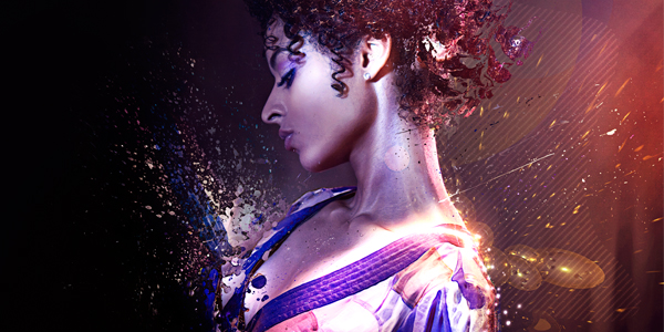
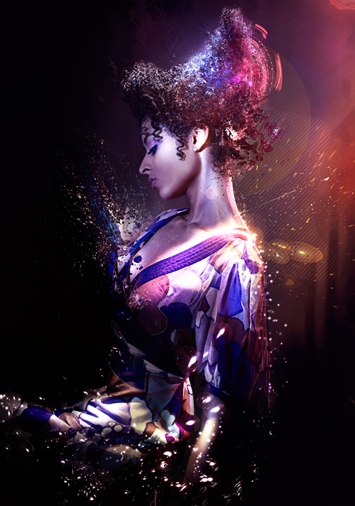
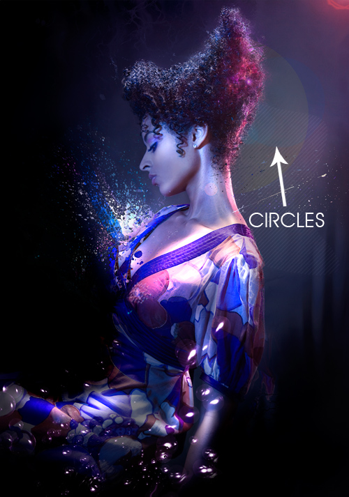
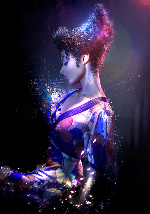
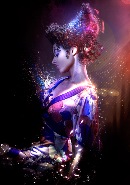
Final Image Preview
Take a Look at the image we’ll be creating. The full PSD will be downloadable at the end of the tutorial process.
Step 1:
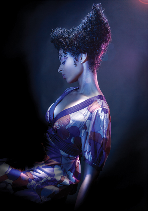
Let’s start by downloading the actual image we will be using Stock by Mo-01. Now that we have downloaded the image we will be using from their dedicated server, you can fire up Photoshop. Now open up the image in Photoshop and duplicate the background layer. With the background layer duplicated go to Image>Transform>Flip Horizontal. This is what you should have at the moment.
Step 2:
Now let’s add a Linear Gradient, select your gradient tool from the Photoshop Toolbar (Shortcut: G) we will be using two colors – #bf294d and #391948 after you have setup your gradient (Supplied Gradient outcome below) change the blending options of the layer to Soft Light and change the Opacity to 51% After that grab the Eraser tool and erase the parts you don’t want in the image.

Step 3:
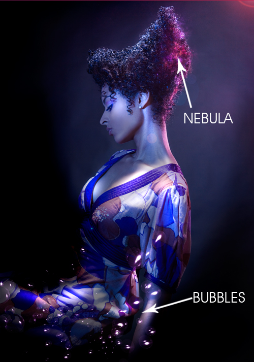
Now it’s time to add some elements. I used a Nebula called Binary Stock by Moonchilde-Stock on Deviantart – Open it in Photoshop and drag it into your canvas, set its blending mode to Linear Dodge and start rotating, resizing and erasing till you are happy with its placement in your image.
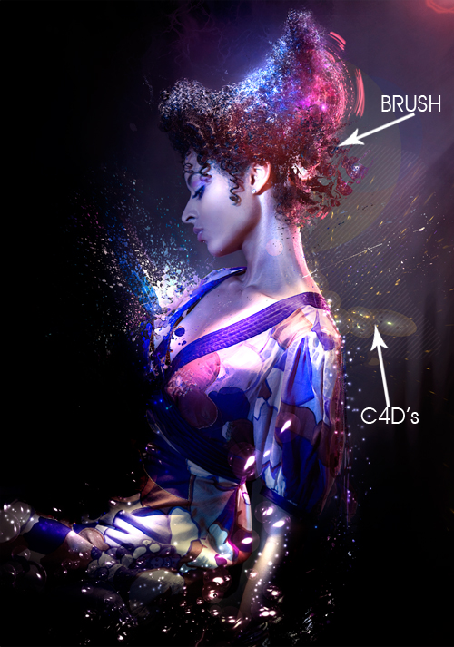
Now grab a Bubble C4D, you can get some C4D resources from Stinky666 on Deviantart. I used a Bubble C4D. Open it up in Photoshop and set the blending options to Linear Dodge and place the C4D on the Left Hand side, reason being the bubbles flow with the movement of the photo.
Step 4:
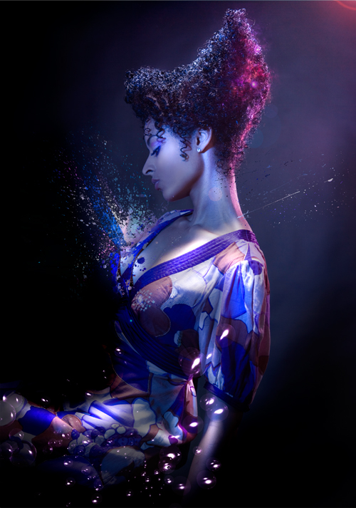
Moving on to our 4th step this is where the fun part comes in. We will be using Splatter Brushes called Hi-Res Splatter Brushes by Bittbox and applying Clipping Masks over them to create a great insertion into our illustration. You will never get the same result that is why I love to use the technique.
Create a New Layer by going to Layer>New>Layer – Name your Layer and hit OK, you will now have a new layer to work in. Grab yourself some splatter brushes from your brush palette and brush on your canvas, it doesn’t matter what color the brush is at the moment. Once you have added your splatter, hide the layer with the splatter brushing on. Create a New layer and go to Image>Apply Image – This basically Copy Merges your entire document and gives you a full layer. Unhide your Splatter Brush layer and select your Applied Image Layer now go to Layer>Create Clipping Mask or press (Shortcut: CTRL +ALT + G) now you will be able to use your Move Tool (Shortcut: V) to move the image around inside your Splatter Brush. I repeated this process three times on various places.
Step 5:
Create a New Layer and fill it with Black #000000 set the blending mode to Color Dodge and the Opacity to 77% now use your brush tool to brush some color onto her. I used a 900px soft brush with the colors #837e81 and #811757 – The color choices are totally up to you though. Now repeat that step again and use a 900px soft brush with the color #3b3a0a and set the blending mode to Color Dodge. I used this Color to add some brightness to the wall behind the model.
Now create a New Layer and apply the image (shortcut: CTRL + ALT + SHIFT + E) now go to Filter>Distort>Wave and hit the randomize button a few times. Now change the blending options of the layer to Lighter Color and erase the parts of the image you don’t want.
Step 6:
Lets create a New Layer and apply the image (Shortcut: CTRL + ALT + SHIFT + E) now go up to Filter>Stylize>Glowing Edges use these Settings: (Edge Width – 3 | Edge Brightness – 9 | Smoothness – 1) after applying the Glowing Edges Filter select the layer and go up to Image>Adjustments>Invert OR press (Shortcut: CTRL + I) This should change the entire layer into white and black, change the blending options of the layer to Multiply. You should see that this affects the image with shadows.
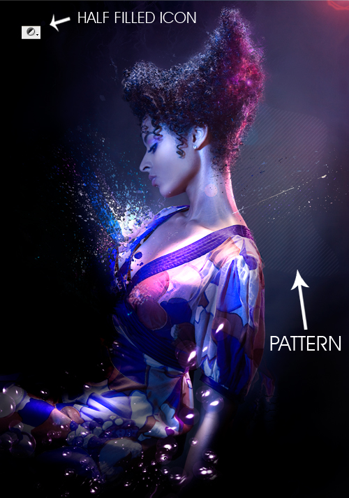
Next create a new layer and grab your Lasso Selection tool (Shortcut: L) draw a selection on the canvas that corresponds with the flow of the image. After you have drawn your selection go to the little half filled icon on your Layers Panel at the bottom and select Pattern. I selected a skew line pattern to fit into the motion of the image. After you have selected your pattern and pressed ok set the blending options of the layer to Soft Light and drop the opacity down to 22%
Step 7:
Create a new layer and grab your Elliptical Marquee Tool (Shortcut: M) and draw a Circle behind her head whilst holding SHIFT to keep it symmetrical. Fill the Selection with Yellow #f5f32a and set the blending options to Soft Light and the Opacity to 13% – Repeat the process but, this time create a smaller circle and fill it with Blue #00acec set the blending options to Soft Light and the Opacity to 13%. Create a New Layer and Apply Image once again (Shortcut: CTRL + ALT + SHIFT + E) go up to Filter>Distort>Wave and Randomize the effect and hit OK. Keep the Blending Options of this layer on Normal just erase parts of the image layer you don’t want.
Step 8:
Lets create a new layer and grab a splatter brush. Add the brush to a place on the canvas where it will add to the flow of the image. After you have added your splatter brush hide the layer and create a new layer. Apply Image on the new layer (Shortcut: CTRL + ALT + SHIFT + E) and unhide the splatter brush layer now select the applied image layer and Create a Clipping Mask (Shortcut: CTRL + ALT + G) position the image as you like it.
Time to brighten up our image, create a new layer and Fill it with Black #000000 set the Blending Options to Color Dodge – Grab your brush tool and use some color to spice up the Image, I used – #4f4e0e green – #784c13 brown – #748694 light blue/grey This was the First Set.
I then repeated the process and used #584515 brown – #324c66 blue – #53173e pink, this was the Second Set.
I repeated the process again and used #3e2100 dark brown – and #2c2a2a a dark grey, I then set the Blending Options to Color Dodge and the Opacity to 78%. This was the Third Set.
I once again repeated the process and used #FFFFFF White with a star brush and set the blending options to Color Dodge. This was the Fourth Set. You can see the outcome of these steps below the Sets.


Step 9:
Now let’s go down to the Half Filled Icon on our Layers Panel and Select Gradient Map use the default gradient Black to White and hit OK. Drop the Opacity of the layer down to 68% and erase some of the darkness on the models face and upper body. Next grab this spirals light photo from Stock.xchng and open it up in Photoshop. Insert it into your canvas and change the blending options to Linear Dodge, move it up to her head and erase the front part as if it is sitting on top of her hair at the back.
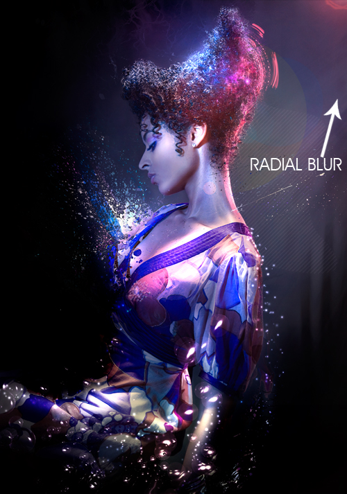
Now Create a new layer and Apply Image (Shortcut: CTRL + ALT + SHIFT + E) now go up to Image>Adjustments>Threshold and use the default settings. Now go up to Filter>Blur>Radial Blur Use a Zoom method and set the strength to 100% now click inside the white box and drag it to the upper right corner and hit OK. You should see that your Threshold layer is now Radial Blurred coming from the Right Hand side. Change the Blending Options to Linear Dodge and drop the Opacity to 13% and erase what you don’t want.
Step 10:
Now we are going to be adding a few Adjustments. Firstly Go down to the Half Filled Icon on your Layers Panel and Select Levels. Use the Settings I have supplied Below (11 | 1.00 | 245) and change the Blending Options to Luminosity and the Opacity to 58% – Next add a Green Photo Filter from the Half Filled Icon menu and set the Blending Options to Soft Light and the Opacity to 17% – Now go to Adjustments menu (Half Filled Icon) once again and Select Solid Color use the Color #fa8b08 Orange and set the Blending Options to Soft Light and the Opacity to 8%


Step 11:
In this step we will be adding a few more C4D’s to correspond to the image. I used Bubble C4D’s from Stinky666. I inserted the first bubble C4D and set the blending Options to Linear Dodge and erased the parts I didn’t want. I then proceeded to Insert another bubble C4D and set the Blending Options to Linear Dodge and erased the parts of the C4D that I didn’t want.
Next I created a new layer and grabbed my brush tool and proceeded to brush on the models head. I then went up to Filter>Distort>Wave and randomized the effect. I then hid the layer and created a new layer and Applied Image (Shortcut: CTRL+ALT+SHIFT+E) then I made the brush layer visible and created a clipping mask from the Applied Image layer and moved it around a bit to get the effect that I wanted.
Step 12:
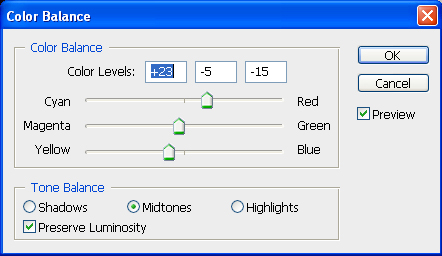
Lets go to the Adjustments (Half Filled Icon) Menu and select Color Balance use these settings (+23 | -5 | -15) I provided a image below too. Next I used the Clone Tool to lengthen the Light streak on her shoulder a few pixels. You select the Clone Tool in your Photoshop Toolbar (Shortcut: S) and you make sure that the setting Sample on the top toolbar is set to ALL LAYERS and not just CURRENT LAYER. Now create a new layer and go to your image press and hold down ALT you will see the cursor change and click on the lighting on her shoulder. Now let go of ALT and use the brush to lengthen the streak by clicking and dragging.
Next create a new layer and fill it with Black #000000 and change the blending Options to Color Dodge and the Opacity to 71% I then used a Large Soft Brush with the colors #6d6513 green – #947934 orange – #7b7270 grey, I have provided the color layer I used. This corrected the path of the Lighting for the image with some extra color and brightness.
Step 13:
Go to the Adjustments Menu (Half Filled Icon) and select a Green Photo Filter change the Blending Options to Soft Light and the Opacity to 10%. Next go back to the Adjustments Menu and Select Brightness and Contrast add Brightness +2 and Contrast +15.
Next up, go back to Adjustments Menu and select Gradient Map use the default Black to White gradient and hit ok leave the Blending Options as is and change the Opacity to 50% now erase the parts of the Gradient map that you do not want. Now create a new layer and apply image in that layer (Shortcut: CTRL + ALT + SHIFT + E) then use the Burn Tool (Shortcut: O) and darken all of the over bright areas on the image.
Step 14:
We are going to be adding a few more Adjustments. Go to the Adjustments Menu and Select Gradient Map click inside the gradient to open up the gradient options and select the Purple to Orange Gradient from the Default list – Colors are – #290a59 to #ff7c00 – Now set the Blending Options to Screen and the Opacity to 16% now erase the unwanted areas.
Next add another Gradient Map and select the Purple to Red to Yellow Gradient from the list – Colors are – #0a00b2 to #ff0000 to #fffc00 – then set the Blending options to Soft Light and the Opacity to 11%. Now add another Gradient Map but this time use the default Black to White Gradient. Set the Blending Options to Multiply and the Opacity to 15%
Step 15: (Final Preview)
This is going to be our last step in the process so let’s go down to the Adjustments Menu and Select Black and White and use the default settings. Set the Opacity to 25% and Erase some of the details you don’t want or need.
Now create a New Layer and Apply Image (Shortcut: CTRL + ALT + SHIFT + E) go to Filter>Other>High Pass use the default setting of 10 and then set the Blending Options to Soft Light and the Opacity to 53% this should sharpen out the image.
Thanks for taking part in the tutorial hope you learned some new techniques.
Great tutorial. the detail in it is outstanding!
Most help articles on the web are iancuctrae or incoherent. Not this!
SUPER!!!!
I really like it
I could figure out how to do something similar by simply trying and undo-ing a bunch…. but I could NEVER be able to recall all of my steps in such extreme detail in order to share the process… wow! thanks for this guys!
Thanks An1ken for this amazing tutorial.
If you enjoyed this tutorial, make sure you check out An1ken’s website at CreativeOverFlow.net
Awesome tutorial.. Though pretty complex for me at my level of photoshop knowledge haha
Thanks, good tutorial.
nice…
thank
Awesome tutorial! nicely done 🙂 Thanks for sharing!
Hahaha Sn3h roY, I lik3 It Als0….!i Co0l TutorIal & I hav3 a Qu3stion Do u lik3 GraPhicS TutoRial’s…
Mail your’s Ans On:
SmartBrain535@hotmail.com
Shure we will be cheking an1ken’s web, this tutorial is really great. I`ve seen some others particles effects tutorial but this is so far the best in the web.
Thanks for posting. http://www.aditivovisual.com
Nice…
That was an awesome tutorial Thanks!!
Thanks for the great tut – there were a couple techniques I hadn’t used before. 🙂
I forgot to thank you for taking the time to provide links to the materials used as well as the finished psd – that was very considerate of you!
thank you so much for sharing 🙂 ill surely gona try this out..
once again thanks for sharing your work-flow and tips with us 🙂
hey… this is pretty cool… thanks for showing it to us…
Great stuff, I love that you covered the particle effect, it’s been a bit of a mystery to me for some time now. 🙂 Pretty simple though! Thanks!
Another great tutorial. There are so many instances that these technics can be used to enhance images and logo’s. It would be interesting to see you use these effects on B&W images that also use colour.
Keep up the good work
Jamie
great work, i enjoyed thinks….
pretty kool i will link this to my site
Very very very very very brilliant!!!!!!!!
I love it!
woow…nice
wow, thank you so much for this awesome tut! so much detail and juss wonderfful 🙂
god bless. I love you thanks for the tut!
great photowork..fantastic, wonderfull…
you are great
thx! very helpful
Simply delicious, Thanks for sharing your skills with us; with this action we are getting an internet more friendly for all.
guy, this is awesome! will like to have more of your works. sure will try this one out.
i like it
nice hardskill!
like this! very nice! thank you!!
step 5:”Now change the blending options of the layer to Lighter Color and erase the parts of the image you don’t want. ”
wad does that lighter color means?at blending options theres no “lighter color”,what should i do?
@A: In Photoshop, you should have a drop down in the layers panel to select a layer blending mode. It should have an option called “Ligher color”. Which version of Photoshop are you using?
Great manip!.
Regards.
Thx alot for sharing this! Really great tutor
Hot stuff!
thnx da, very helpfull techniques
thanks owesome tutoriols
Really nice tut, did it on my own image, this was madd long tho, but i enjoyed it.
Just found this, thanks for sharing. Im doing somethig similar and this has helped me tones. Cheers
Dankie Jacques, dis nice om nog n Suid Afrikaner hier raak te loop! Where in SA are you?
Thanks 4 awesome tutorial
está espectacular el tutorial, me ha sido de gran ayuda porque necesitaba aprender ese tipo de efectos es facil de seguir aun sin saber hablar ingles como me pasa a mi, THANKS
Editor’s Translation : The tutorial is spectacular, I have been a great help because I needed to learn this type of effect is easy to follow even without knowing how to speak English as happen to me, THANKS
Fantastic girl! Incredible! It seems a fairy
Pretty amazing work!
OMFG O_O AMAZING & u Even gave us the Tut PSD
very cool 🙂
woow…..super…..nice
wOoWw…………………………
sUPeR
Awesome tutorial! Thanks for sharing!
aww hell man wow great stuff, nice to SEE FELLOW SOUTH AFRICANS doing their thing. veri nyc!
Thanks for the time you have invested in this tutorial & all the freebies.
Is it possible to recreate this in CS2 as it is the one I am currently having & I am not in a position to upgrade to CS3?
so magic!`
fantastic… it shows the imagination of human is unlimited… somehow technology is one of the best way of self expression………..
i loooooooooooooooooooooooooooooooooooooooove this.i wish i cud it…
wow nice tutorial..tq
Wow… I really learned a lot. Thank you so much for sharing your knowledge. God bless you more
this is out of the world man.. who do you manage these thing..?? plz tell
mee..
that is a wonderful tuto, thank you for the author
Really thank you, it looks outstanding!
Congrats!
good show….
thank you so much for creating this amazing site.
COOLLLL!!! Thanks Alot!
cool tutorial. this is just amazing. thanks
Great work in photoshop
really amazing how you can articulate this and appreciate the estimated time it would take. What a beautiful photo to start with and it is hard to believe you actually made it more attractive.
Thank you very much for sharing this. This is a great website!
i don’t know how to do step 4. i think this splatter brushes with this clipping mask is very hard and my picture doesn’t look like the original here …
this one here is a very shiny one but mine isn’t shiny! Because, i think there is now shiny place or thing in the picture I can move into the brush …
maybe you can help me with the 4.th step?!
AWSOME!
Very nice and easy to follow tutorial, but like verena said how can you make colors so shinny at step 4:)
this is great stuff….thanks so much
Bagus banget tutorialnya…. thx.
Very complicated
omg,,, i love thiss!!
Thanks for teaching it for us >.<
Whoa… Wicked! Thanks heaps for posting this. It is really inspiring. I tried illustrating a mascot design for a project of mine and couldn’t seem to get it right. In the end I decided on getting some professional help. The designers at http://www.mascotdesigncorner.com managed to realize my vision of illustrating a character design that was above expectations. I highly recommend them. For the price I paid it was indeed a steal. I guess I am not good at designing at all. Anyway, thanks for providing a source of inspiration I might add. This site rocks big time…
Thanks for this tut. Very impressive, very usefull. I learned lot of thinks.
Great tutorial,but the girl has a disgusting hairstyle.
it’s rally Awesome…
super a good tutorial
emmmmmmmmmmmmmmm thanks sooooooooooooooooooooooooooooooooo much
Great!,
I have just used this tutorial in a 3d industrial work.
Thanks
太美了~~ (so beautiful)
super good,good website.
Some of these Effects you’d expect to be really hard… when in fact, they’re SO easy!
Thanks to those I’ve made some cracking edits!
THANK YOU THANK YOU THANK YOU!! SOO AWESOME 😀
Your welcome!
You have some seriously good like going on. That should be step 1 😉 Thanks for sharing!
This is awesome !! thankyou so much for the tutorial !! 😀
really nice, thnx for the tutorial.
awesome!!!!
Great tut. my outcome http://markcape.deviantart.com/gallery/41169030#/d5oi3or
Nice one! Din’t download the spatter brushes so didn’t get the splashy effect but all the other stuff worked out perfect for me for my poster! Learned a lot of new stuff so thanks again! 🙂
thank you soooooooooooo much
Thank you SO much for posting this and keeping it posted throughout the years!
This is one gem of a tut.
A million thanks from a PS newbie who is struggling to make her own violin recital poster.
ammmmmaaaaaaaazzzzzzzziiiiiinnnnnngggggg!!!! mean AMAZING!! 😀 THANK YOU FOR TUTORIAL 🙂