Contact Us
Copyright & Usage
Facebook
Twitter
Home
Freebies
Tutorials
Articles
Contact Us
Licensing
Featured Tutorials
Featured
•
Tutorials
Taking Type to the Next Level with Alternate Characters
84 Comments
Photoshop
•
Tutorials
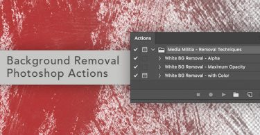
Removing a White Background with Photoshop Actions
122 Comments
Photoshop
•
Tutorials
How To Create Vibrant Lighting Effects From Scratch
84 Comments
Illustrator
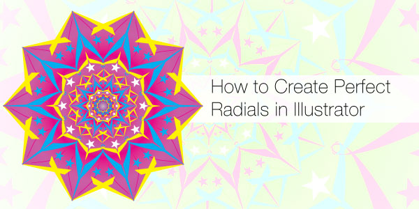
How to Create Perfect Radial Shapes in Illustrator
20 Comments
View all of our tutorials