
If you love typography like I do, you are always looking for a new way to funk out your type – just to make it look a little different than the rest. 3ds Max has some amazing and creative ways to make your type look absolutely beautiful! In this tutorial I will show you how to extrude text, tweak it out, manipulate the mesh, and then exporting it out to Photoshop to add in some extra elements. Hope you enjoy it!
About
Time: 1-2 Hours
Software Required: Photoshop CS3+, 3ds Max 2009 + (Don’t have 3ds Max? Download the free 30-day Trial)
Required Resources
Download the Media Militia Resources
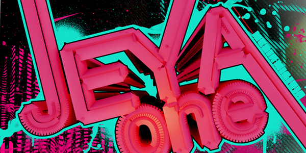
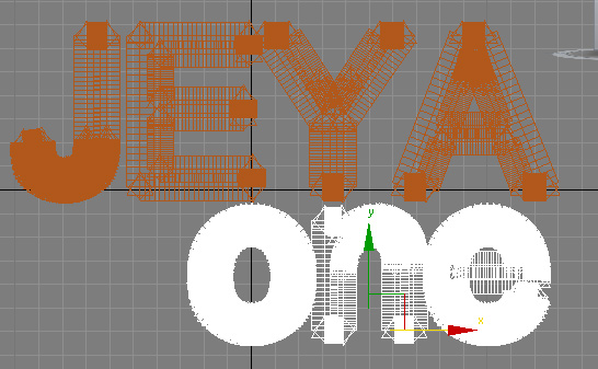
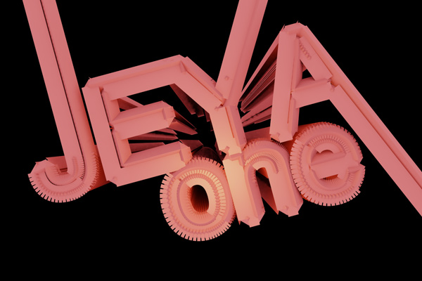
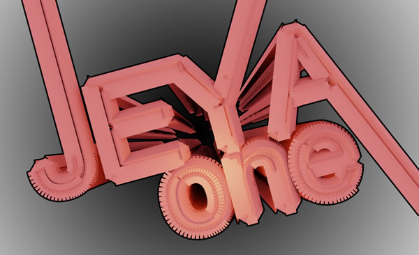
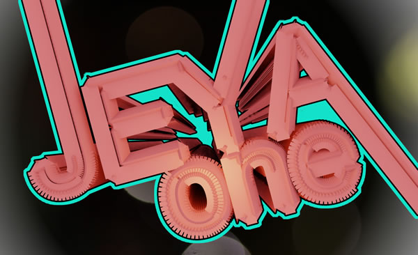
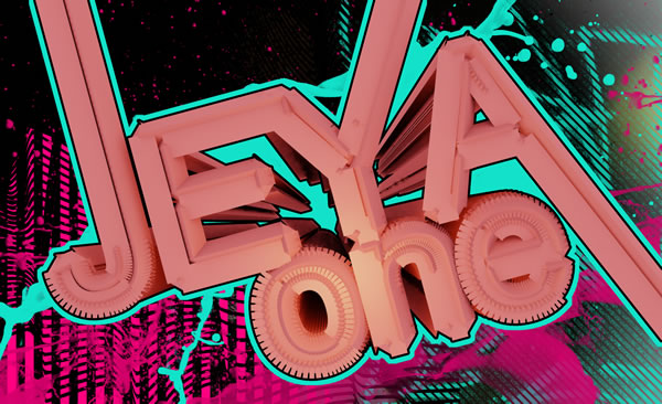
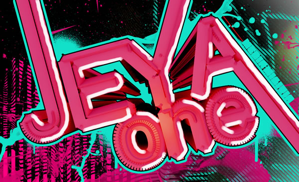
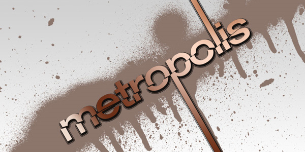
Final Image Preview
Take a look at the design we’ll be creating. The final PSD will be available for download at the end of the tutorial.
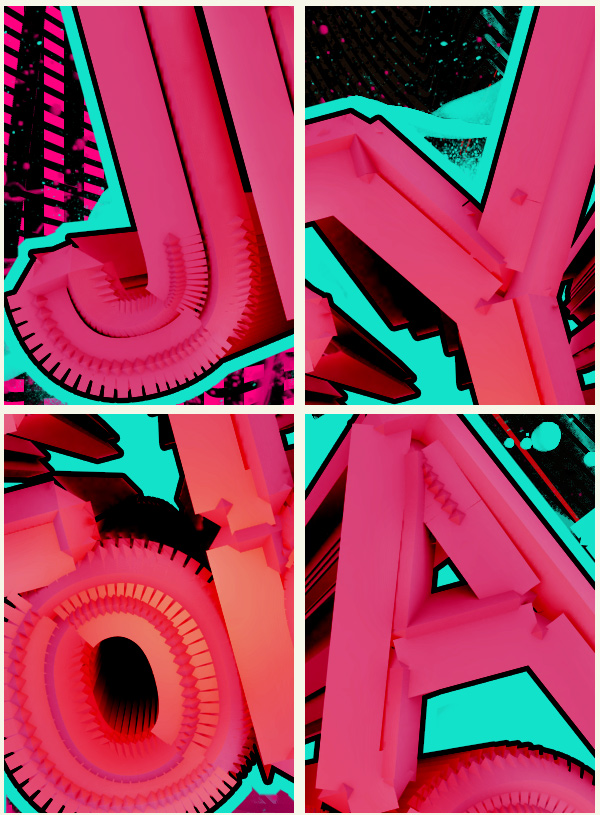
Detail
Step 1:
First off, we need to create the text.
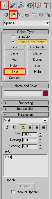
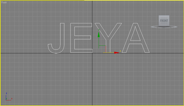
Open up 3ds Max. In the Create tab, click on the Shapes button. Click on the Text object type button. Then type in JEYA in text area in capital letters. We will use Arial with the font size at 100.
Step 2:
In the Front view, click, drag and align the text to the X axis as shown below.
Tip: You can use the Select and Move tool to better align the text.
Step 3:
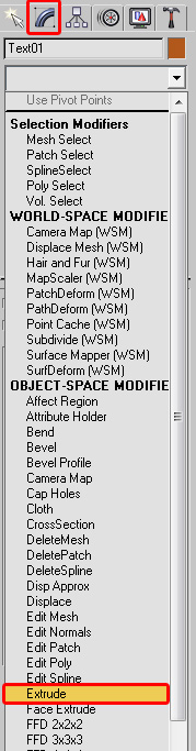
With the text still selected, click on the Modify tab. In the Modifier List drop down choose Extrude.
Step 4:
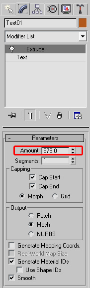
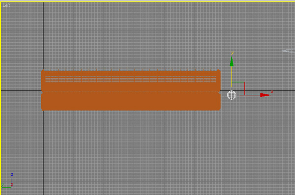
In the Parameters roll out, change the Amount to 579
Step 5:
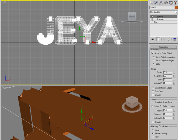
In the Modifier List drop down, choose Lattice. Use the following Settings:
Radius: 6.5
Segments: 23
Sides: 3
It should look similar to the following image:
Step 6:
Now we are going to create the other text that will go below our main JEYA text. Because we want all the same settings on the new text, we will clone the original JEYA text.
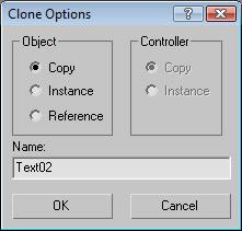
In the Edit Menu, choose Clone (CTRL+V). In the Clone Options, choose Copy. Click OK
Step 7:
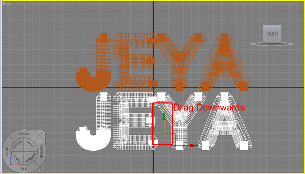
Make sure the Select and Move tool is selected. In the Front View port, drag the Y green arrow downwards. The cloned text should be just below the original JEYA text.
Step 8:
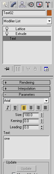
Make sure the cloned text is still selected. In the Modify tab, click on Text in the stack order. Change the Text to say "one" in lowercase.
Step 9:
Using the Select and Move Tool, reposition the "one" text to the right side – just below the "JEYA" text. I aligned the bottom of the "Y" with the top of the "n"
Step 10:
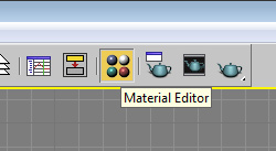
Open the Material Editor by clicking on the button in the toolbar or press M on your keyboard.
Step 11:
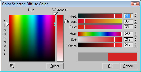
Click on the Diffuse Color Selector and type in the following colors:
Red: 214
Green: 35
Blue: 35
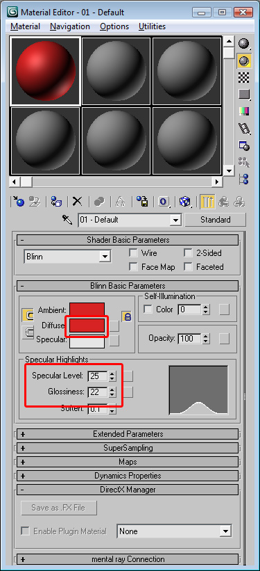
Change the Specular Level to 25 and the Glossiness to 22
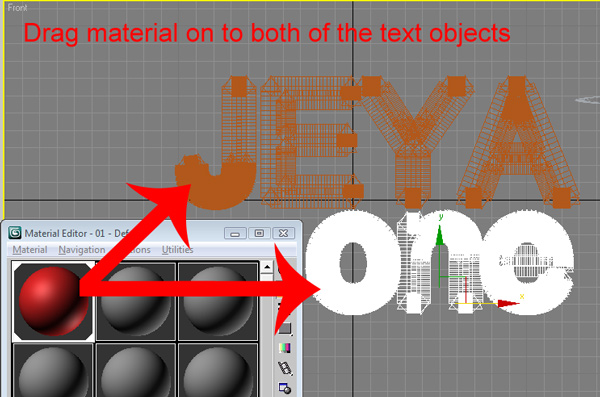
Step 12:
Now we need to apply the material. Drag the material from the Material Editor on to both of the text objects.
The text should change to the color Red. If they don’t try dragging it again.
Step 13:
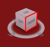
In the Perspective View, you need to activate it by right clicking anywhere in the view. The view should turn yellow.
Click on the Front side of the ViewCube.
Tip: If you don’t see the ViewCube, you can use the keyboard shortcut: Alt+Ctrl+V.
Step 14:
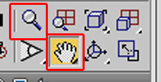
Im the bottom left, use the Pan View tool and drag the text into the view. Then use the Zoom Tool to pull away by dragging downwards in the Perspective View.
Tip: You can also pan by dragging in a viewport while pressing the middle button of a three-button mouse. To zoom, roll your mouse scroll wheel.
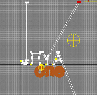
Use both of the tools until you get it matched up like the following:
Step 15:
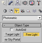
In the Create Tab, click on the Lights button. In the Lights drop down box choose Photometric.Then click on Free Light.
You should get a dialog box asking you to change the Exposure control, choose Yes
Step 16:
In the Perspective view, click and drag the Free Light just over the "o" in the "one" text.
In the Left view, move the the light with the Select and Move tool to look like the following:
Tip: Look at the grid spacing to judge distance. You might need to use the zoom tool to find the light in the viewport.
Step 17:
In the Photometric – Free Light Modifier properties change the Color to Halogen (Warm)

Step 18:
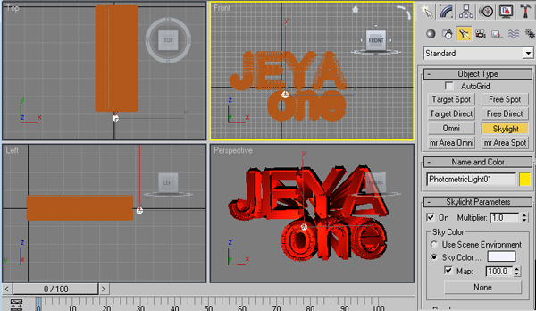
In the Create Tab, click on the Lights button. In the lights drop down choose Standard. Click on the Skylight button.
Step 19:
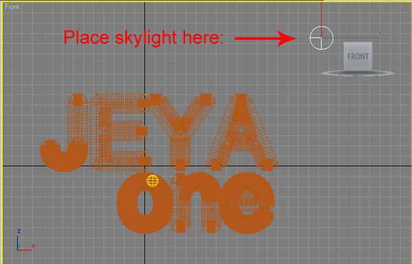
In the Front view, place the skylight in the upper right hand corner as pictured below:
Tip: Remember you can use the Pan View Tool to pan around the view.
Step 20:
In the Front view, using the Select and Move tool, select the JEYA text.
Open the Modifiers Tab. Control click on the Lattice and Extrude modifiers to select both of them.
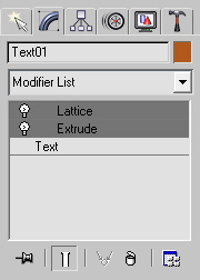
Step 21:
Right click on one of them and choose CUT. You should be left with just the JEYA text.
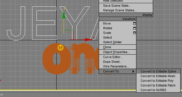
Now Right Click on the JEYA text and choose Convert To: > Convert to Editable Spline
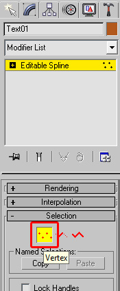
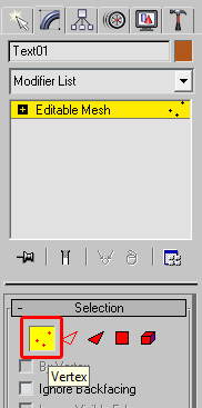
Step 22:
In the Modifiers Tab, Selection roll out, Click on the Vertex button.
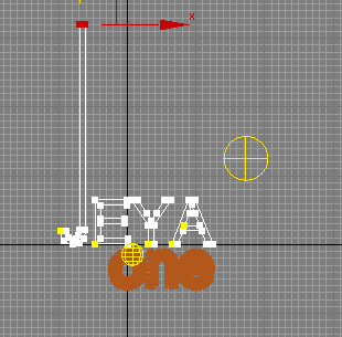
Step 23:
In the Front View, select the end of the letters vertex points to extend them.

Step 24:
Use the Select and Move tool and drag them all the way up.
Tip: Zoom out to drag the vertices higher.
Step 25:
Do the same with the "A" and "Y". I also pulled the top part of the "E" into the "Y"
Note: You will need to move on both the Y and X axis for diagonal lines.
Step 26:
With the JEYA text selected, go back into the Modify tab. right click on Text in the modifiers stack and choose Paste.
This will paste back in the Lattice and Extrude modifiers.
Step 27:
Right Click on the JEYA text and choose Convert To: > Convert to Editable Mesh.
In the Modify tab, click on the the Vertex selection button.
Step 28:
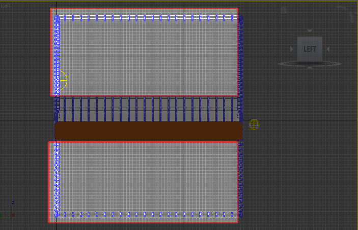
In the Left view, you need to delete all background vertices that don’t look good in the perspective viewport.
Select them by using the Select and Move tool. Make a selection around them and press delete. Here are the vertices I deleted.
Step 29:
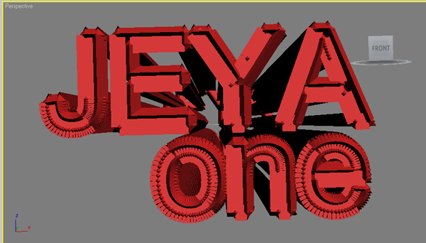
Make the Perspective view active, then click on the Orbit Tool.

Anywhere outside of the Orbit right drag to the left making it rotate about 30 degrees or until your text looks good to you.
Tip: Remember you can use the Pan View tool and Zoom to get a look that you like.
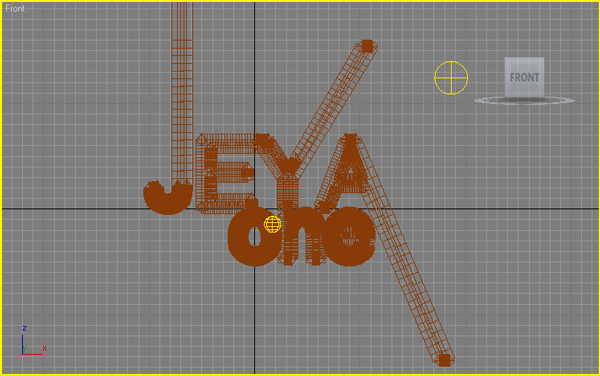
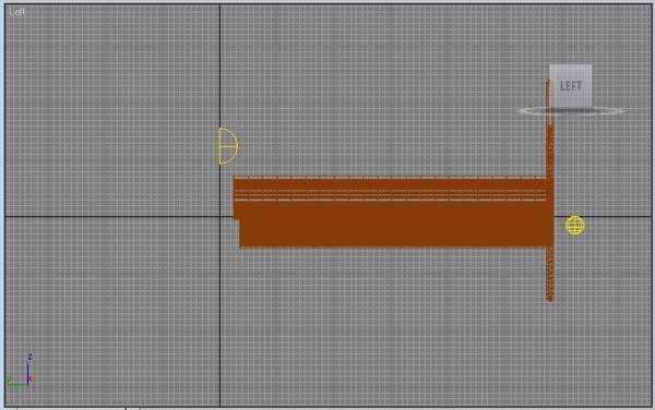
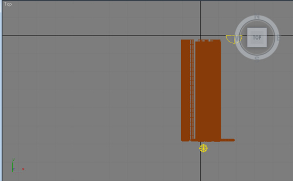
Here is what I ended up with in each of the views:
Tip: Look at the light placements. Do yours match up?
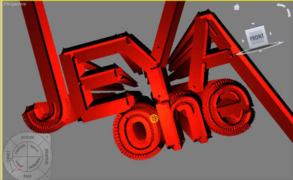
Perspective:
Front:
Left:
Top:
Step 30:
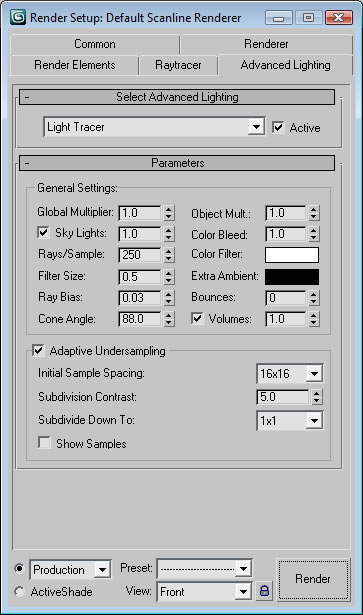
Now go to Rendering > Render Setup. Change the Output Size Width to 1500 and the Height to 1000.
Click on the Advanced Lighting tab.
Change the Select Advanced Lighting drop down to Light Tracer
Step 31:
Finally! Make sure the Perspective view is still active and Click on the Render button. After it is done rendering, click on the Save icon in the render window.
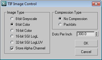
Change the Save as Type to TIF and click on the Setup button.
Make sure you put a check mark on the Store Alpha Channel. Press OK. Name the file and press Save.
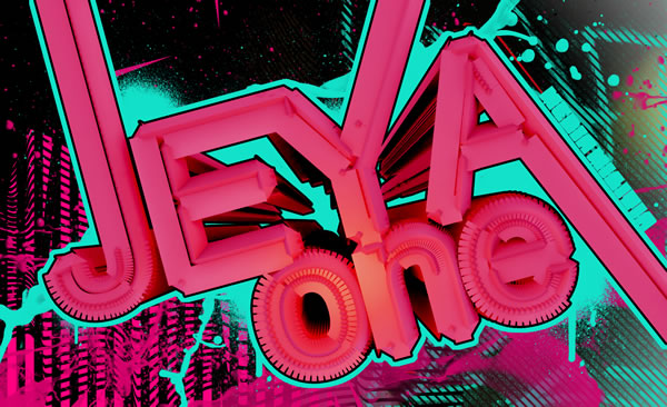
Here is my final render:
Step 32:
Now it’s time to open Photoshop.
Open your TIF into Photoshop. I included my TIF in the resources if you would prefer to use that for the following steps.
In your layers panel, ALT + Double Click on the Background Layer to unlock it.
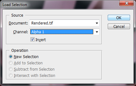
Now go to Select > Load Selection. Make sure the Alpha channel is selected and Check Invert. Click OK
Step 33:
Press Delete to remove all the black from the background.
Go to Select > Deselect
Name this Layer "Main Text"
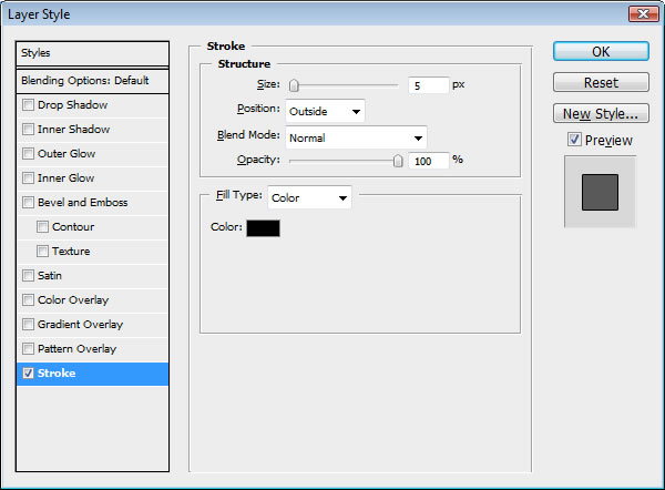
Double Click on the Main Text layer to bring up the Layer Style dialog.
Check Stroke and Change the stroke Size to 5. Make the color = Black.
Step 34:
Create a New Layer by going to Layer > New > Layer. Name it "Background." Make sure it is below your Main Text Layer.
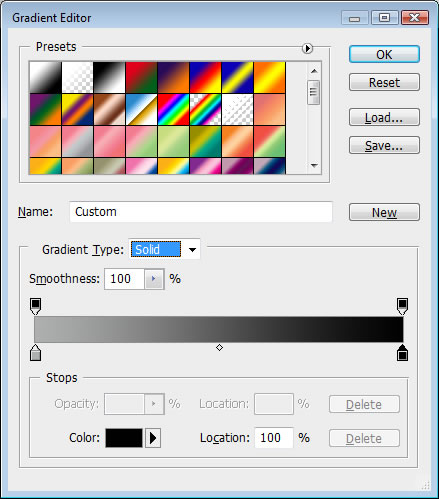
Using the Gradient tool, make a Radial Gradient from #aeafaf to #000000. Make the center point black as shown in the picture below.
Step 35:
In the resources you downloaded, open Bokeh.jpg. Copy and paste it into your PSD.
Make sure it is above the Background Layer but underneath the Main Text Layer. Change the Layer Blending Mode to Overlay.
Name this layer Bokeh.
Step 36:
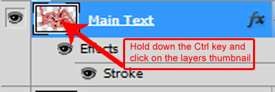
Hold down the CTRL key and click on the layer thumbnail for the Main Text layer to create a selection.
Step 37:
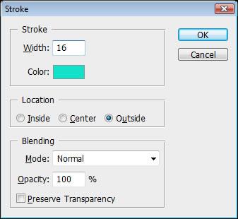
Create a new layer just below the Main Text layer. Name it “Outer Stroke.”
Go to Edit > Stroke. Make the stroke color #12e2ca and the Size = 16 pixels.
Step 38:
Using a brush fill in the areas in the center of the text that didnt get filled in with the stroke. It should look like this now:
Step 39:
From the resources, bring in Spraypaint1.png and place in the PSD. Move it into the left side. Make sure it above the bokeh layer. Name the layer “Spraypaint1”
From the resources, bring in lined graffiti.png and place in the PSD. Move it into the right side. Make sure it above the Spraypaint1 layer. Name the layer “graffiti”
Step 40:
From the resources, bring in splash1.png, verticle lines.png, and lineart.png. Arrange them so they look like the following:

Step 41:
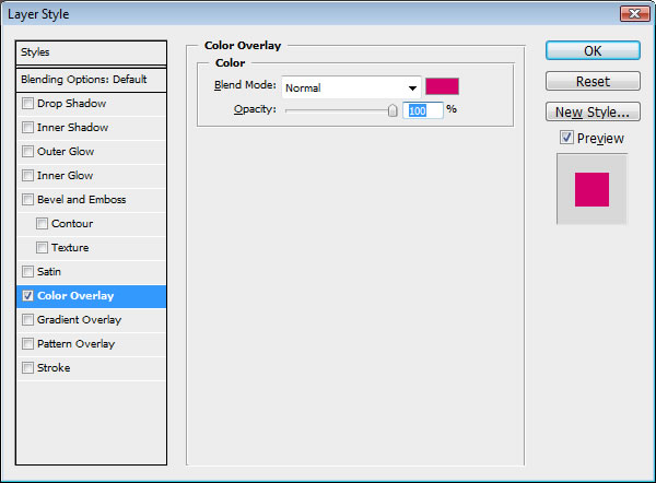
Duplicate the Splatter layer by going to Layer > Duplicate Layer
Double click on the duplicated layer and add a Color Overlay. Use the color #d5006b
Step 42:
Duplicate the Splatter layer again by going to Layer > Duplicate Layer. Move it to the right hand side.so you can see if better.
Duplicate it two more times and add a color overlay using this color: #12e2ca. Move the layers around the canvas.
Step 43:
Open the Brushes panel. Click on the pop-up menu and choose Load Brushes. Use the Graffiti Brushes you downloaded from the resources.
Brush in some spray paint splatters and drips to your liking. I used the color #12e2ca
Tip: Change the brush size to get different looks.

Step 44:
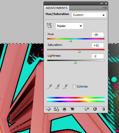
Create an Adjustment Layer by going to Layer > New Adjustment Layer and choose Hue/Saturation Use the following settings:
Hue: -18
Saturation: +12
Lightness: -2
Step 45:
Now we need to create a clipping mask, so that the Hue/Saturation will only effect the Main Text Layer
Hold down the ALT key and position your cursor in between the two layers (the cursor changes to two overlapping circles) and click. It should create a down arrow on the Hue Saturation layer.
Tip: You can also create clipping masks by choosing the top layer and going to Layer > Create Clipping Mask
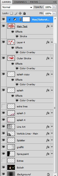
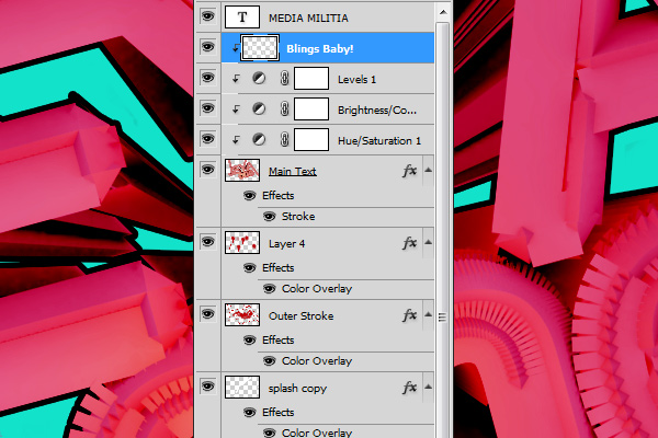
Here is the layers stack so far:
Step 46:
We are now going to do the same with a brightness and contrast layer.
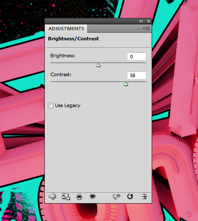
Go to Layer > New Adjustment Layer and choose Brightness/Contrast
Change the Contrast to 58
Step 47:
Make sure this adjustment layer is also a clipping mask. If it is not, then make it one.
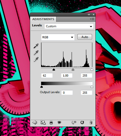
Now create another adjustment layer. This time choose Levels. Use the following settings:
62 – 1 -255
Step 48:
I added a MEDIA MILITIA text on the side of the A with the same light blue we used earlier. The font I used is Metal.
Create a new layer and name it “Blings Baby!” Using a white brush outline the right and bottom sides of the letters.
I used a White brush – 20 pixels at 100% hardness. You should have something like this now:
Step 49:
Go to Filter > Blur > Gaussian Blur. Make the Radius: 28.9 pixels.
Change the Layer Blending mode to Soft Light and lower the Opacity to 54%.
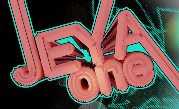
Step 50:
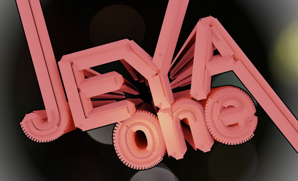
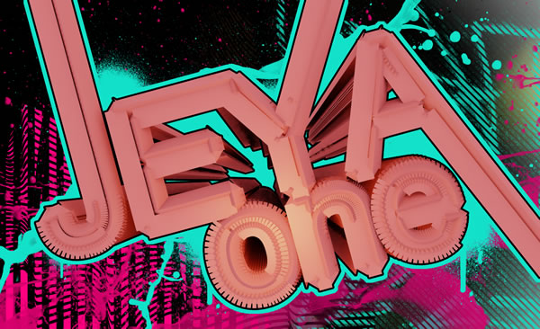
That’s it! Here is the final design. Hope you enjoyed this tutorial!
thats an nice creative design Jeyaone – keep it up
Awesome Tutorial, love the detail and the outcome. Keep em coming.
more!
Hey man very creative tutorial!!! thanks for sharing. http://www.aditivovisual.com
This is extremely COOL
I loved the final result
nice combination of stuffs pal.. cool! keep going on.. 🙂
my man you did a great design i love it.
looks like a great tutorial for beginners (me)
Thanks heaps
thanks,i have to learn more from u.
Just amazing, great stuff. I love this site 🙂
Hi great Tutorial but i use 3Ds Max 2011 and at step 11 this Diffuse Color Selector thing i just dont get it searcht for over an hour now so would be great if someone coul help me with that 🙂
Greetz Seemless
@Seemless – They did change a lot in 3ds max 2011. Check out the What’s new video. http://area.autodesk.com/3dsmax2011
They show where to access the Diffuse Color now.
I havent been able to play around with 2011. So far how do you like it? I need to get it soon and update the tutorials. Thanks for pointing it out.
First thanks for replay 🙂
Yae finally i found it and the 2011 Version is realy nice i didn´t use any previous Version so i cant compare it but seems to be very user frendly
i just get it cuz of this Tutorial and i think i will use it on with some other Tutorials to get in it 🙂
(Sry for my English i´m from Germany 😉 )
Greetz Seemless
Hey, the rendering isn’t working for me. I’m doing exactly what you wrote, but all I get is a black screen as soon as I click render.
Can you help me out?
Thanks.
Are you selected in the correct viewport when you press the render button? Try selecting the Perspective viewport.
With the sheer number of faces involved in the scene and light tracer active, it takes a really long time to calculate how the photons will act in the scene, so let it sit for as long as it needs (sometimes an hour or more, depending on what you’re rendering) and you’ll start to see results. It really does take patience. You could also try lowering the output resolution, or lowering the number of segments in the lattice step to make it faster.
Hey, in step 16, I cant figure out how to “drag” the light over? What exacly am I dragging? Thanks
hee when i render it its like totally zoomed it how do i change that ?
Beautiful job….
I learned a lot doing this! Great tutorial!
its realy good creative …….i hvnt any word
nice yaar
Very inspiring! nice work 🙂
great!
Thanks awsome tutorial
Cool outcome! Thanks!
Cool! Next time try it with blender, then everyone can play! 🙂
pic thq u…..
thq u…………………..
hey awesome tut but when I render all I get is
a black screen I’m in the perspective viewport
the render setting is also in the perspective
any advice
Thanks for this tutorial.. Was a great practice!
Can anyone explain how to get the alpha 1 channel I’ve looked on the internet but couldn’t find anything that would give me the same result as this guy’s