
Photoshop

Create an Electric Feel in Photoshop

Design a Paint Splashing Effect Into Your Image

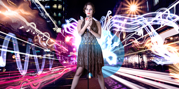
Create Electrifying Light Effects Around an Image
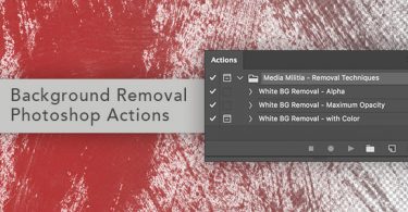
Removing a White Background with Photoshop Actions

How To Create Vibrant Lighting Effects From Scratch

How To Create Amazing 3D Type

Design an Intense Particle Illustration using Photoshop
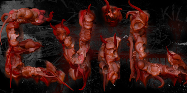
How to Create Gross Evil 3D Text (+Video)