
Tutorials

Create an Electric Feel in Photoshop

Design a Paint Splashing Effect Into Your Image

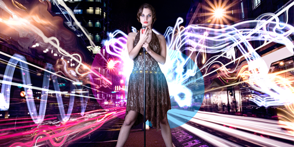
Create Electrifying Light Effects Around an Image

Taking Type to the Next Level with Alternate Characters
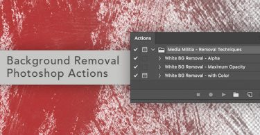
Removing a White Background with Photoshop Actions

How To Create Vibrant Lighting Effects From Scratch

How to Create Perfect Radial Shapes in Illustrator

How To Create Amazing 3D Type